Edit In-App Messages
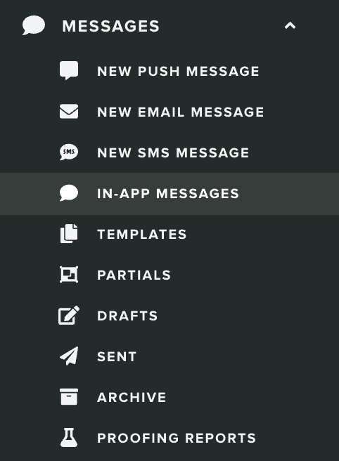
To access this area, in your app's menu, expand the Messages menu item and click in In-App Messages:
Next, go ahead and click in the in-app message you wish to edit:

This will take you to a wizard divided in five different tabs like shown below. Some sections are optional and you will notice that they are marked as ready by default.

Setup
In this section you will need to provide a basic configuration for your in-app messages. You will start by providing a name, so that you and your team can later use when searching for in-app messages.

You should then select one of the contexts available for you. This field will determine which app cycle event we should use to display the in-app message.

You have two options, you can either display the in-app message only at launch (when your app is launched after being in an inactive state) or for both launch and foreground (apps return to foreground when opened while being in a background state).
Optionally, you can also select a priority:

This value will be used when more than one in-app message is available for a user. Because users might be eligible for more than one in-app message, the priority will define which one should be displayed. The in-app message with the highest priority will be the one displayed.
Additionally, you can also define a delay. This should be a number in seconds which we will use to delay the presentation of the in-app message. It shouldn't be bigger than 60 seconds.

This might be useful, if you would like to wait a few moments before presenting the in-app message.
Finally, you should define how often we should display the in-app message. You can choose between displaying it all the time:

Or once every x amount of time:

This option might be useful if you don't want to continuously present the same message during short periods of time.
Audience
By default, if no criteria is provided, all users in your app will be presented with in-app messages. In this section, you can use our familiar custom criteria selection to target specific group of users instead.

You can learn more about how to setup a criteria in our guides located here.
Duration
If you would like to provide a lifetime for this in-app message, you can set it in the Duration tab. In this section, you can provide the start and end date for a message by providing a date in From and Until fields:

Segmentation
If you would like to automatically categorize users when they open in-app messages, you can use segmentation rules to do so. Click in the Segmentation tab:

Learn more about how to setup segmentation rules in our guides located here.
Content
In this section, you will define what content you wish to show to your users. You start by selecting the type of in-app message you want:

You will have 3 options at your disposal, Banner, Card and Fullscreen. Each type will have different requirements, which we will dive-in below.
Banner
This type will display a small banner at the top of your app. It is the ideal type if you are looking to present short bits of information without much disruption. The user can simply dismiss it by clicking outside its area.
It will accept an optional image:
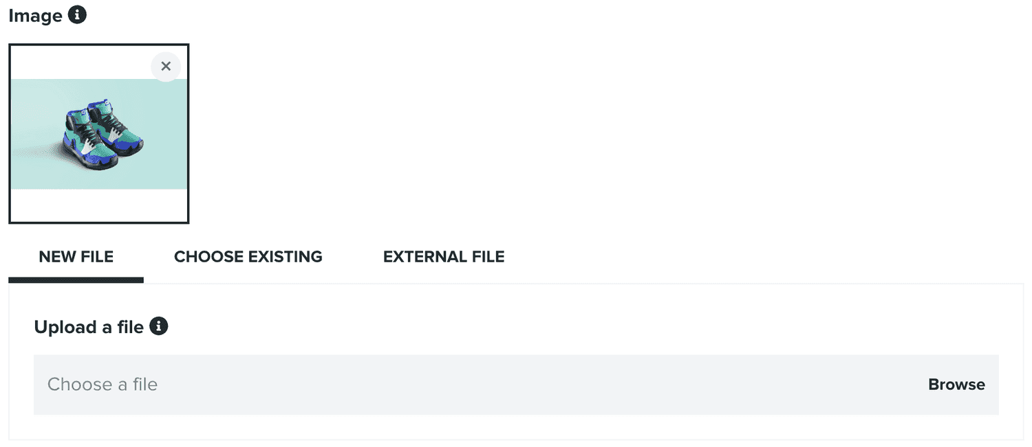
Which will be presented as a thumbnail at the left side of the banner.
For this type, you must always provide a title:

And you must always provide a message:

Optionally, you can also provide an action:
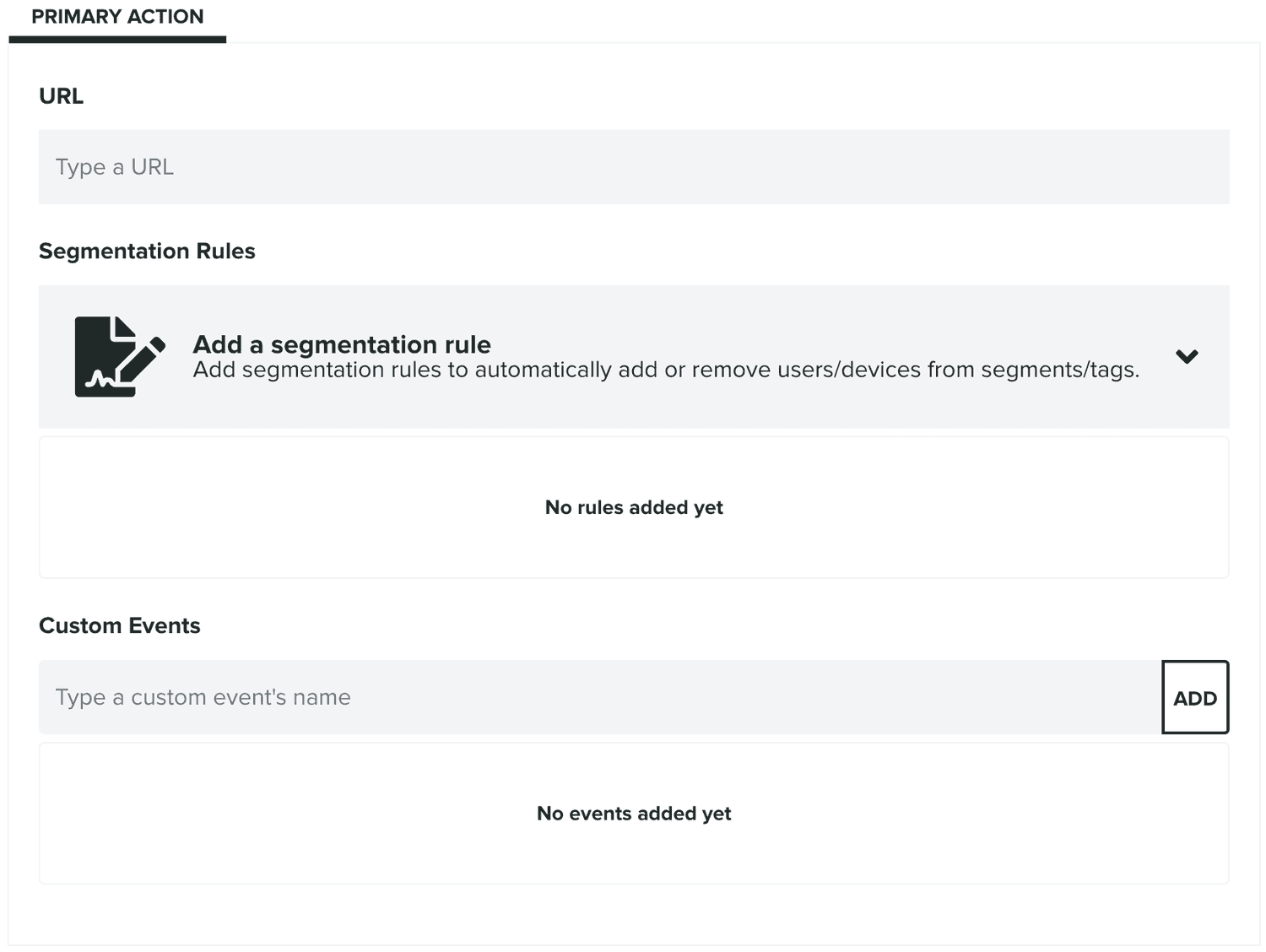
If provided, this action should contain a URL (also allows URL Schemes that your app might support) which we will invoke whenever the user clicks in the banner. These clicks are also measured and their conversion displayed for you in the list of in-app messages.
When a URL is provided, you can also provide segmentation rules or custom events. Whenever users click those actions we will execute any rules or custom events you provide. Segmentation rules allow you to automatically categorize users when they click these actions. You can then use these to later on target users that engaged with these in-app messages.
Pretty much the same way, custom events will also be automatically registered. If you have access to our Automation add-on, you can use these events to create follow up push campaigns.
Card
This type will display a dialogue window in your app. It is the ideal type if you are looking to present small bits of information, rich media and a prominent call-to-action.
You can include an optional image:

This image will be displayed in the top of the text you include in your card.
For this type, you can should always provide a title:

And a message:

You will always have to provide a primary action:
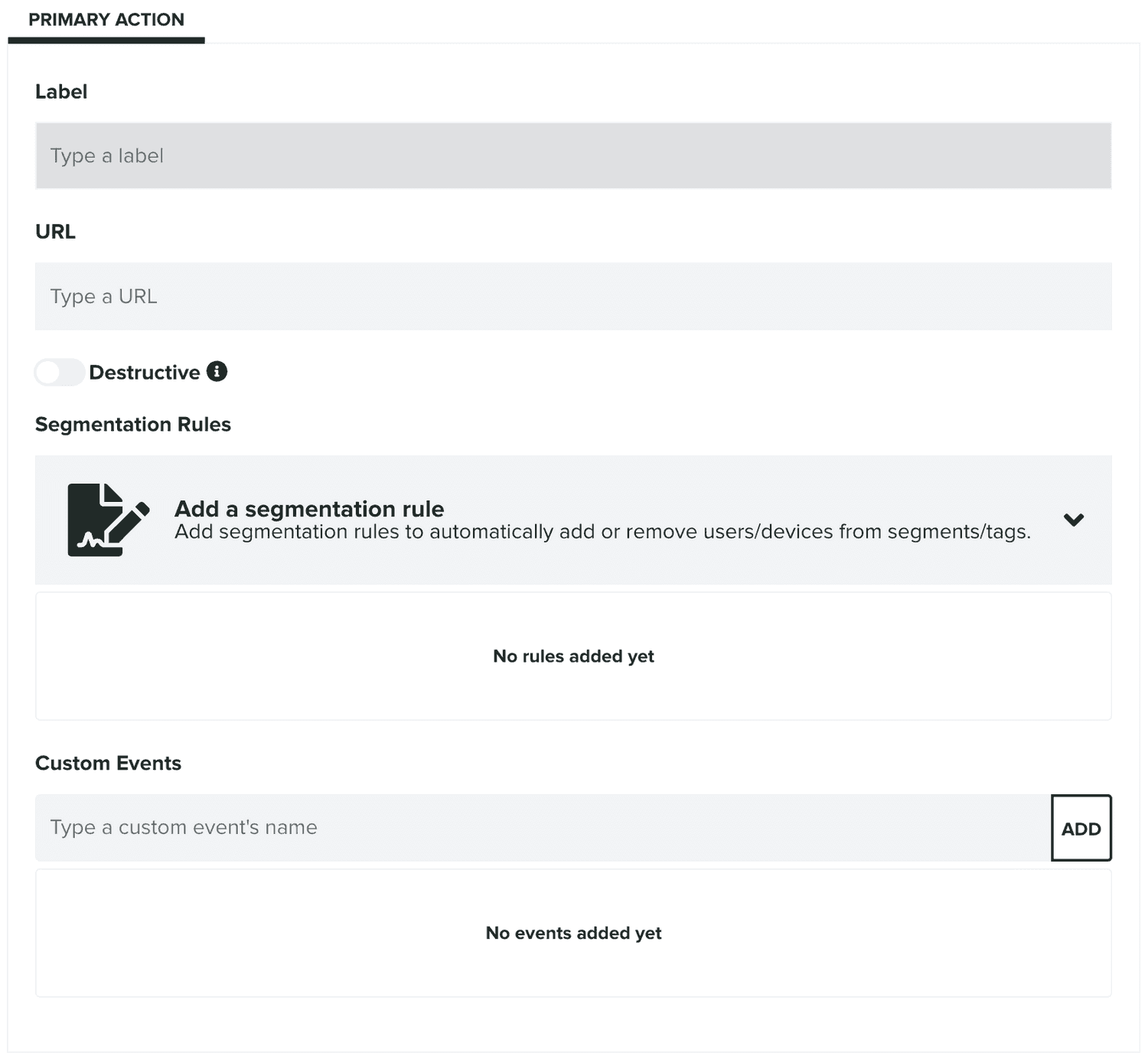
This action should always contain a label and URL (also allows URL Schemes that your app might support) which we will use to display a button in the card. We will then invoke the URL whenever the user clicks in the banner. These clicks are also measured and their conversion displayed for you in the list of in-app messages.
You can also define this action as destructive, which we will then use to display a button using system built-in styles that performs an irreversible operation.
You can also provide segmentation rules or custom events. Whenever users click those actions we will execute any rules or custom events you provide. Segmentation rules allow you to automatically categorize users when they click these actions. You can then use these to later on target users that engaged with these in-app messages.
Pretty much the same way, custom events will also be automatically registered. If you have access to our Automation add-on, you can use these events to create follow up push campaigns.
This type also support a secondary action:
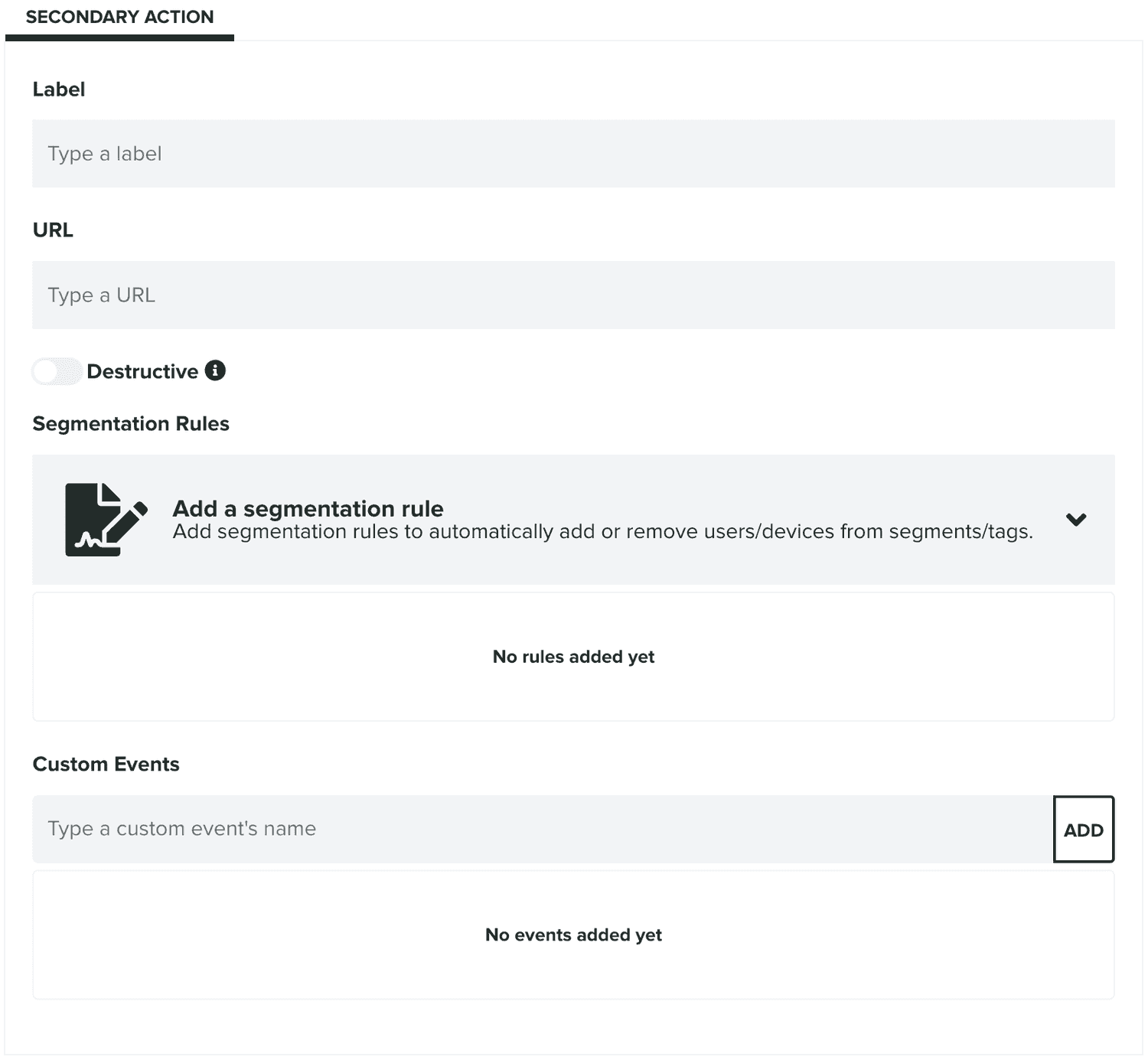
Just like the primary action, when provided, it will create a second button in the dialogue card with the same capabilities as the primary action.
Fullscreen
This type will display a fullscreen overlay view in your app. It is the ideal type if you are looking to present rich media information that grabs the attention of the user.
It will require an image:

Or an optional landscape version of the image:
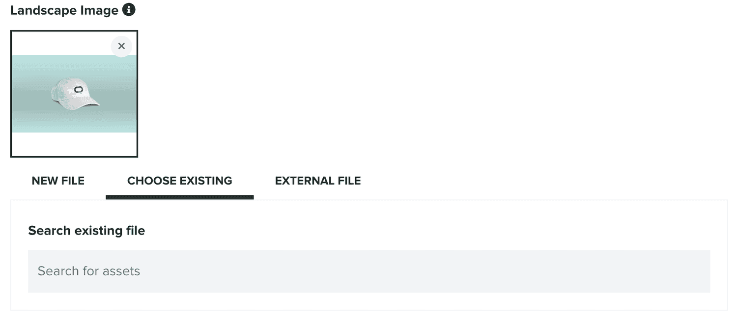
Both these images will be presented in the allotted space of this view.
For this type, you can provide an optional title:

And an optional message:

Optionally, you can also provide an action:

If provided, this action should contain a URL (also allows URL Schemes that your app might support) which we will invoke whenever the user clicks in the banner. These clicks are also measured and their conversion displayed for you in the list of in-app messages.
When a URL is provided, you can also provide segmentation rules or custom events. Whenever users click those actions we will execute any rules or custom events you provide. Segmentation rules allow you to automatically categorize users when they click these actions. You can then use these to later on target users that engaged with these in-app messages.
Pretty much the same way, custom events will also be automatically registered. If you have access to our Automation add-on, you can use these events to create follow up push campaigns.
Once you are done, click in the Save button to actually save your changes:
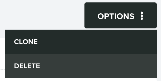
In this page you can also clone the partial. This is done via the Options menu by clicking in Clone:
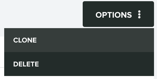
It is also possible to delete the partial. This is done via the Options menu by clicking in Delete:
